Scientific Color Palette Tool

Scientific Color Palette Generator for Colorblind-Safe Research Figures

Pick a palette family, preview it on your actual chart type, and copy hex, Python, R, or CSS in one click — 10 colorblind-safe palettes from Okabe-Ito to Crameri Vik, plus presets matching Nature, Science, Cell, NEJM, and PNAS.

Colorblind-FriendlyHex · Python · R · CSSFree, No Sign-Up

Distinct hues for unordered groups — treatments, species, cohorts.

Selected palette

Okabe-Ito

8 colors

Colorblind-safe
000000
E69F00
56B4E9
009E73
F0E442
0072B2
D55E00
CC79A7
Source: Okabe & Ito, 2002

Best for: unordered groups, treatment comparisons, multi-line charts.

Figure preview

Same data, redrawn with the selected palette

Group 1Group 2Group 3Group 4
#000000, #E69F00, #56B4E9, #009E73, #F0E442, #0072B2, #D55E00, #CC79A7

All 10 Scientific Color Palettes at a Glance

Click any palette card to load it into the generator above

Okabe-Ito

The color-blind safe default

Colorblind-safe
000000E69F0056B4E9009E73F0E4420072B2D55E00CC79A7

Eight discrete colors designed by Okabe and Ito (2002) so every category stays distinguishable for readers with protanopia, deuteranopia, and tritanopia. The most widely recommended categorical palette in scientific publishing.

→ Up to seven groups in bar charts, scatterplots, and multi-line figures.

Source: Okabe & Ito, 2002

Paul Tol Bright

Print-safe qualitative

Colorblind-safe
4477AAEE6677228833CCBB4466CCEEAA3377BBBBBB

Paul Tol's bright set: seven distinct colors validated for color blindness and tested against PDF print conversion. The categorical palette of choice when Okabe-Ito's yellow is too soft for projector display.

→ Seven-group survey charts, lecture slides, posters that must reproduce in print.

Source: Paul Tol, 2018

Tableau 10

The modern default

Not CB-safe
1F77B4FF7F0E2CA02CD627289467BD8C564BE377C27F7F7FBCBD2217BECF

Tableau's flagship categorical palette and matplotlib's post-2015 default. Not colorblind-safe — adjacent reds and greens collide for deuteranopes — but visually balanced and widely recognized in dashboards.

→ Internal analytics dashboards and stakeholder decks where review accessibility is informal.

Source: Tableau Software (matplotlib 2.0+ default)

ColorBrewer Set2

Soft categorical fills

Not CB-safe
66C2A5FC8D628DA0CBE78AC3A6D854FFD92FE5C494B3B3B3

ColorBrewer's pastel categorical set: lower saturation, easier on the eye for figures with large filled areas. Not fully colorblind-safe.

→ Stacked area charts, pie charts, choropleth maps with up to eight categories.

Source: ColorBrewer 2.0 (colorbrewer2.org)

Glasbey

High-category categorical

Not CB-safe
D700008C3CFF02880000ACC798FF00FF7FD16C004FFFA530

An algorithmically generated palette of maximally distinct colors for cases where you genuinely need 10 or more categories. The 8 hex codes shown here are the first 8 of colorcet's glasbey_bw_minc_20 (avoids near-black and near-white). Not colorblind-safe, but the only honest answer when other palettes collapse.

→ Cluster plots with 10–20 categories, cell type maps, situations where direct labeling is not feasible.

Source: colorcet glasbey_bw_minc_20, first 8

Viridis

The sequential workhorse

Colorblind-safePerceptually uniform
4401543B528B21908C5DC863FDE725

Perceptually uniform purple-to-yellow gradient with monotonically increasing luminance. Designed to stay legible under color vision deficiency and to survive grayscale conversion. Replaces matplotlib jet for serious work.

→ Heatmaps, density plots, intensity maps, sequential continuous data.

Source: matplotlib van der Walt & Smith, 2015

Cividis

Colorblind-optimized sequential

Colorblind-safePerceptually uniform
00204D414D6B7C7B78BCAF6FFFEA46

Mathematically optimized for deuteranomaly and protanomaly. The dark-blue-to-yellow ramp is monotonic in luminance for both standard and most CVD vision, and the palette reproduces predictably in print.

→ Sequential figures where the audience is known to include colorblind readers.

Source: Nuñez, Anderton & Renslow, 2018 (PLOS ONE)

YlOrRd

Warm sequential

Not CB-safe
FFFFB2FECC5CFD8D3CF03B20BD0026

ColorBrewer's yellow-orange-red ramp for sequential warm data. Not colorblind-safe — readers with protanopia compress the red end — but unmatched for thermal and risk-tier figures.

→ Risk heatmaps, temperature ramps, severity indices where warmth carries semantic meaning.

Source: ColorBrewer 2.0 sequential

RdBu

The diverging standard

Colorblind-safe
CA0020F4A582F7F7F792C5DE0571B0

Red-white-blue diverging palette from ColorBrewer. Each side ramps perceptually toward a neutral midpoint, making it ideal for above- and below-zero data. The most-published diverging palette in research figures.

→ Correlation matrices, log-fold-change heatmaps, anomaly maps.

Source: ColorBrewer 2.0 diverging

Crameri Vik

The scientific diverging

Colorblind-safePerceptually uniform
001261307DA6ECE5E0C37243590008

Fabio Crameri's perceptually uniform diverging colormap, designed for geophysics but adopted widely in neuroscience and climate science. Colorblind-safe by construction, with symmetric luminance about the midpoint. The 5 hex stops shown here are evenly sampled from the official 256-color vik.txt distribution.

→ Geophysical anomaly maps, neuroscience activation maps, any diverging plot that must pass CB review.

Source: Crameri Scientific Colour Maps, vik (5-stop sampled)

What Is a Scientific Color Palette?

A scientific color palette is a carefully selected set of colors optimized for research figures. Unlike decorative or brand palettes, scientific palettes are designed against three constraints: accessibility (legible for color-vision-deficient readers), perceptual uniformity (equal numeric steps map to equal visual steps), and reproducibility (consistent across displays, print, and grayscale handouts).

Every palette in this generator has been peer-reviewed in research papers or methods journals. Okabe-Ito (2002), Paul Tol's qualitative sets (2018), Viridis and Cividis (2018), Fabio Crameri's Scientific Colour Maps (2018, 2020) — every one comes with a published rationale and a citation, not a designer's aesthetic preference.

Pick the Right Palette in 30 Seconds

Cross-reference data type and category count to a recommended palette

Data typeCategoriesRecommended paletteCB-safe
Categorical groups (treatments, species)2–7Okabe-ItoYes
Categorical groups, print-heavy figure2–7Paul Tol BrightYes
Categorical groups, dashboard2–10Tableau 10No
Categorical, high category count10+GlasbeyNo
Sequential (heatmap, density)ContinuousViridisYes
Sequential, CB-priority audienceContinuousCividisYes
Diverging (above- and below-zero)ContinuousRdBuYes
Diverging, geophysics or climateContinuousCrameri VikYes

Why Colorblind-Friendly Palettes Matter

Approximately 8 percent of men and 0.5 percent of women have some form of color vision deficiency. Many high-impact journals — including Nature, Science, and PNAS — now require or strongly recommend colorblind-accessible figures in their author guidelines.

  • Reviewers with deuteranopia or protanopia see your figure differently than you do — flagging red-green collisions is one of the most common revision requests.
  • Colorblind-safe palettes look indistinguishable from standard palettes for readers with normal vision, so you lose nothing aesthetically.
  • Standard palettes such as Okabe-Ito and Viridis make your work immediately recognizable as professional in the eyes of a peer reviewer.
  • Accessible figures get cited more, because more readers can actually parse them at a glance.
  • Your figures reproduce predictably in grayscale printing — the second most common reason figures fail copy-editing review.

What Top Journals Actually Use

Informed by ggsci conventions and observation of recent figures

No high-impact journal publishes an official house palette. The conventions below are pieced together from the ggsci R package (a community-maintained set of palettes inspired by major publishers), the Okabe-Ito categorical palette widely accepted in life sciences, and observation of recently published figures. Treat them as starting points, not as official style guides.

Nature, Nature Methods, Nature Communications

Muted qualitative palettes (Okabe-Ito and close relatives) plus Viridis-family sequentials. The author guide explicitly requires colorblind accessibility, and reviewers cite this guideline in revision requests. Preset source: Okabe-Ito 5-color subset.

Science, Science Advances

Slightly warmer palette mix, heavier use of orange-red diverging gradients. Most figures keep to three or four colors per panel; anything beyond that draws pushback in revision. Preset source: ggsci R package pal_aaas().

Cell Press (Cell, Neuron, Immunity)

Slightly desaturated Tableau-adjacent reds and blues (#D62728, #1F77B4). Viridis or RdBu for heatmaps. Distinctive in print without being aggressively saturated. Preset source: Tableau 10 5-color subset.

NEJM, JAMA, BMJ, Lancet

Conservative: navy, dark red, gray, with occasional teal. Clinical journals reward palette restraint — editors here actively prefer fewer colors per figure. Preset source: ggsci R package pal_nejm().

PNAS, eLife, PLOS Biology

The most adventurous of the high-impact set — strong adoption of Viridis-family sequentials and Crameri scientific colormaps. Vik and Roma appear in geoscience and neuroscience figures regularly. Preset source: Viridis 5-stop, used here as a stand-in for the PNAS-style sequential workflow.

The pattern across all of these: the higher the impact factor, the fewer colors per figure. If your draft has eight colors in a single panel, collapse it to three or four and use shape, facet, or direct labeling for the rest. Treat the journal presets above as defensible starting points — none of them is a journal-issued style guide.

How to Use These Hex Codes

Paste-ready snippets for the tools that produce most research figures

Python (matplotlib, seaborn)

Wrap the hex list in ListedColormap for heatmaps, or pass it directly to color= for categorical plots. Seaborn's sns.set_palette() accepts the same list. The generator's Python tab ships the full snippet including the import line.

R (ggplot2)

Use scale_color_manual(values = palette) or scale_fill_manual(values = palette) for categorical data. For sequential data, use scale_color_gradientn(colours = palette) with the Viridis or Cividis hex codes.

Excel and PowerPoint

Format > Shape Fill > More Colors > Custom > Hex (Excel 365), or RGB conversion on older Excel. Save the palette as a custom theme color set in your Office template for reuse.

CSS, D3, Vega-Lite

Drop CSS custom properties into your dashboard root, or pass the hex list as Vega-Lite's range array. D3 accepts the same list as input to d3.scaleOrdinal().

Illustrator, Figma, Affinity

Paste hex codes into the color picker, then save the palette as a Creative Cloud Library, Figma style set, or Affinity swatch group for repeat use across figures.

Five Mistakes That Get Figures Sent Back

What journal reviewers and copy editors flag most often

1. Too many colors in one panel

More than seven categorical colors collapses for almost every CVD type and most projector displays. Split the figure into panels or use facets — adding more hues never works.

2. Red-green collisions for categorical data

The single most common revision request. If two adjacent categories use red and green, deuteranopes see them as the same color. Switch to Okabe-Ito or Paul Tol Bright.

3. Jet (rainbow) for heatmaps

Matplotlib jet and other rainbow palettes are not perceptually uniform — visual contrast spikes in green-yellow and flattens in dark blue. Use Viridis or Cividis instead.

4. Categorical palette on ordered data

Concentration, density, and dose-response data all need sequential palettes. Using Tableau 10 for a five-step dose response makes the numerical order impossible to read at a glance.

5. Skipping the grayscale check

Many readers print figures in black and white. Test your figure in grayscale before submitting — Okabe-Ito and Viridis hold up; pastel palettes collapse to indistinguishable greys.

Get Publication-Ready Color Palettes in Three Clicks

No matplotlib hunting. No re-running scripts. No more red-on-green submissions.

Stop rebuilding the same color scheme across Python, R, and Illustrator. Pick a palette family, preview it on your actual chart type, and copy the paste-ready snippet — every palette in this generator is vetted for colorblind safety, perceptual uniformity, and journal acceptance before it ships.

1

Pick a Palette Family

Choose Categorical for unordered groups and treatments, Sequential for ordered data like heatmaps and density, Diverging for above- and below-midpoint values, or Journal for presets tuned to Nature, Science, Cell, NEJM, and PNAS figure conventions. Each palette card shows a Colorblind-safe tag so you know what is review-proof.

2

Preview on Your Actual Chart Type

Switch between grouped bar, multi-series line, and heatmap previews so you see exactly how Okabe-Ito reads on a treatment comparison versus how Viridis reads on a 2D matrix. The preview redraws live as you switch palettes — no exporting, no Photoshop overlay.

3

Copy Hex, Python, R, or CSS

Grab a hex list for Illustrator and Figma, a matplotlib ListedColormap snippet for Python, a scale_color_manual() block for ggplot2, or CSS custom properties for D3 and dashboards. Every snippet is paste-ready — imports included, order preserved, no helper libraries to chase.

One Generator, Three Figure-Making Workflows

Bench researchers · Data scientists · Lecturers and slide designers

Pick the same Okabe-Ito for a Cell figure, a Tableau-style executive dashboard, and a colorblind-safe lecture slide — without rebuilding the palette in three different tools.

Bench Researchers and Graduate Students

Nature · Science · Cell · eLife · PLOS · PNAS

Figures get sent back for two reasons: too many colors, or red-green collisions. The generator gives you Okabe-Ito for seven groups or fewer, Crameri Vik for diverging heatmaps that pass colorblind review, and Cividis for sequential data that survives grayscale conversion.

  • Okabe-Ito, Tol Bright, Viridis, Cividis — palettes journals already accept
  • Per-palette colorblind-safe and perceptually-uniform tags next to every swatch
  • Crameri Vik and the full scientific colormap set, not just matplotlib defaults
Build your figure palette

Data Scientists and BI Engineers

matplotlib · seaborn · ggplot2 · Plotly · Vega-Lite

You don't need another color picker — you need a snippet that drops into ListedColormap, scale_color_manual(), or vega-lite range. Copy the exact line you would have typed: imports included, hex order preserved, ready for pyplot.bar() or ggplot() + scale_*.

  • Python: LinearSegmentedColormap.from_list and ListedColormap snippets
  • R: scale_color_manual() and scale_fill_manual() blocks with named vectors
  • CSS custom properties for D3, Observable Plot, and Vega-Lite range specs
Copy the snippet

Lecturers, Course Designers, and Slide Authors

Lecture slides · Textbook figures · Poster sessions

Your slides go to a 200-seat lecture hall, an online course replay, and a printed poster — all of them have someone in the room with a color vision deficiency. Pick a palette that holds up on projector, retina display, and grayscale handout.

  • Print-safe palettes that don't collapse under low-toner grayscale conversion
  • PowerPoint and Keynote hex paste workflow with single-click Excel format
  • Cividis and Tol Bright — both rated colorblind-safe and lecture-room legible
Pick a teaching palette

Built for Researchers, Not Logo Designers

Every palette here has already been accepted by a journal — not just an aesthetic recommendation

The Scientific Color Palette Generator collects the categorical, sequential, and diverging palettes that reviewers, editors, and replication-friendly data scientists actually use — with paste-ready code for every tool that produces a research figure.

Standard library

10 palettes the journals already recognize

Okabe-Ito · Tol Bright · Tableau 10 · Set2 · Viridis · Cividis · YlOrRd · RdBu · Vik · Glasbey

The palettes reviewers see most often, with hex codes drawn from their original publications. No proprietary AI-generated palettes that get flagged in review.

Colorblind tagging

Per-palette colorblind status — not buried in docs

Eight percent of male reviewers will see your figure differently

Every palette card shows a Colorblind-safe or Not CB-safe tag next to its name. About 8% of men and 0.5% of women have a color vision deficiency — the tag tells you in two seconds whether you are risking that pool.

Code-ready snippets

Paste-ready Python, R, and CSS — not just hex

Imports included. Hex order preserved.

Copy a matplotlib ListedColormap, a ggplot2 scale_color_manual() block, or CSS custom properties — full snippet, ready to drop into your existing notebook or stylesheet.

Journal-informed presets

Nature, Science, Cell, NEJM, PNAS conventions

Informed by ggsci R package + observation of recent figures

No high-impact journal publishes an official house palette. The five presets are pieced together from public conventions: Okabe-Ito subset for Nature, ggsci pal_aaas() for Science, Tableau subset for Cell Press, ggsci pal_nejm() for NEJM, and Viridis for PNAS. Each preset's source is shown on its card.

Perceptually uniform

Viridis, Cividis, and Crameri — built for data

Equal numeric steps map to equal visual steps

Sequential palettes that ramp luminance evenly. Without uniform luminance, your heatmap exaggerates whatever value happens to fall in the middle of the color scale — the source of most figure misreads.

Free, no sign-up

All palettes free, no rate limits

Cividis is not behind a paywall.

No paywall on any palette. No pro tier for Crameri Vik. No sign-up wall before you can copy the hex. Bookmark the page and use it the next time you open a notebook.

The palette tool stays free. Pro unlocks every other Vizcept generator.

The Scientific Color Palette Generator is free — every palette, every snippet, no sign-up. If you also need AI to draw the figure itself (graphical abstracts, conceptual frameworks, signaling pathways, PRISMA flow diagrams), Vizcept Pro covers the rest of the toolkit.

¿Eres estudiante o docente? Solicita el descuento educativo

Solicitar ahora

Used in Papers, Theses, and Lecture Decks

What researchers, data scientists, and educators say about Vizcept's scientific color palettes.

Dr

Dr. Priya Raman

Postdoctoral Fellow, Computational Biology

I used to keep a sticky note of the Okabe-Ito hex codes on my second monitor. Now I copy the ListedColormap line and paste it into the notebook — three seconds, no typos, no off-by-one in the order.

Lu

Lukas Weber

PhD Candidate, Geophysics

The Crameri Vik preset alone saved me a revision round. My anomaly map looked fine on my laptop until a colorblind reviewer flagged the diverging palette. The CB-safe tag pointed me to the right answer in under a minute.

Sa

Sarah Chen

Senior Data Scientist, Healthcare Analytics

Our slide deck has to look the same in Tableau, matplotlib, and PowerPoint. I copy the hex list once, paste it everywhere, and the brand-adjacent palette never drifts between tools.

Dr

Dr. Priya Raman

Postdoctoral Fellow, Computational Biology

I used to keep a sticky note of the Okabe-Ito hex codes on my second monitor. Now I copy the ListedColormap line and paste it into the notebook — three seconds, no typos, no off-by-one in the order.

Lu

Lukas Weber

PhD Candidate, Geophysics

The Crameri Vik preset alone saved me a revision round. My anomaly map looked fine on my laptop until a colorblind reviewer flagged the diverging palette. The CB-safe tag pointed me to the right answer in under a minute.

Sa

Sarah Chen

Senior Data Scientist, Healthcare Analytics

Our slide deck has to look the same in Tableau, matplotlib, and PowerPoint. I copy the hex list once, paste it everywhere, and the brand-adjacent palette never drifts between tools.

Dr

Dr. Priya Raman

Postdoctoral Fellow, Computational Biology

I used to keep a sticky note of the Okabe-Ito hex codes on my second monitor. Now I copy the ListedColormap line and paste it into the notebook — three seconds, no typos, no off-by-one in the order.

Lu

Lukas Weber

PhD Candidate, Geophysics

The Crameri Vik preset alone saved me a revision round. My anomaly map looked fine on my laptop until a colorblind reviewer flagged the diverging palette. The CB-safe tag pointed me to the right answer in under a minute.

Sa

Sarah Chen

Senior Data Scientist, Healthcare Analytics

Our slide deck has to look the same in Tableau, matplotlib, and PowerPoint. I copy the hex list once, paste it everywhere, and the brand-adjacent palette never drifts between tools.

Dr

Dr. Priya Raman

Postdoctoral Fellow, Computational Biology

I used to keep a sticky note of the Okabe-Ito hex codes on my second monitor. Now I copy the ListedColormap line and paste it into the notebook — three seconds, no typos, no off-by-one in the order.

Lu

Lukas Weber

PhD Candidate, Geophysics

The Crameri Vik preset alone saved me a revision round. My anomaly map looked fine on my laptop until a colorblind reviewer flagged the diverging palette. The CB-safe tag pointed me to the right answer in under a minute.

Sa

Sarah Chen

Senior Data Scientist, Healthcare Analytics

Our slide deck has to look the same in Tableau, matplotlib, and PowerPoint. I copy the hex list once, paste it everywhere, and the brand-adjacent palette never drifts between tools.

Frequently Asked Questions

Everything researchers ask about scientific color palettes

Need to Draw the Figure Too?

Vizcept's AI generators turn a paragraph of your manuscript into a graphical abstract, conceptual framework, signaling pathway, or PRISMA flow diagram — every chart pre-colored with the palettes on this page.

Desbloquea todas las herramientas

Con una sola suscripción tienes acceso a todas las herramientas de diagramas con IA de Vizcept: cuerpo libre, árboles sintácticos, biología y mucho más.

Ver precios

Otras herramientas que te pueden interesar

Explora más herramientas de diagramas con IA, dentro y fuera de tu disciplina.

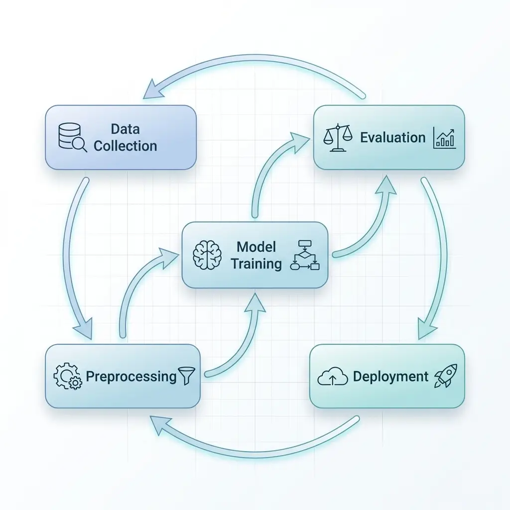
Generador de diagramas con IAPopular

Generador de diagramas con IA

Describe cualquier tema en lenguaje sencillo y consigue un diagrama científico listo para publicar en segundos.

Abrir herramienta
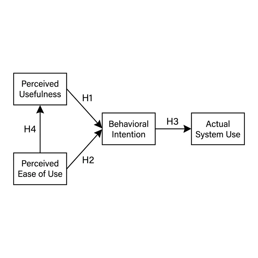
Generador de marcos conceptualesNuevo

Generador de marcos conceptuales

Convierte variables, mediadoras, moderadoras e hipótesis en un marco conceptual etiquetado para tesis y artículos de revista.

Abrir herramienta
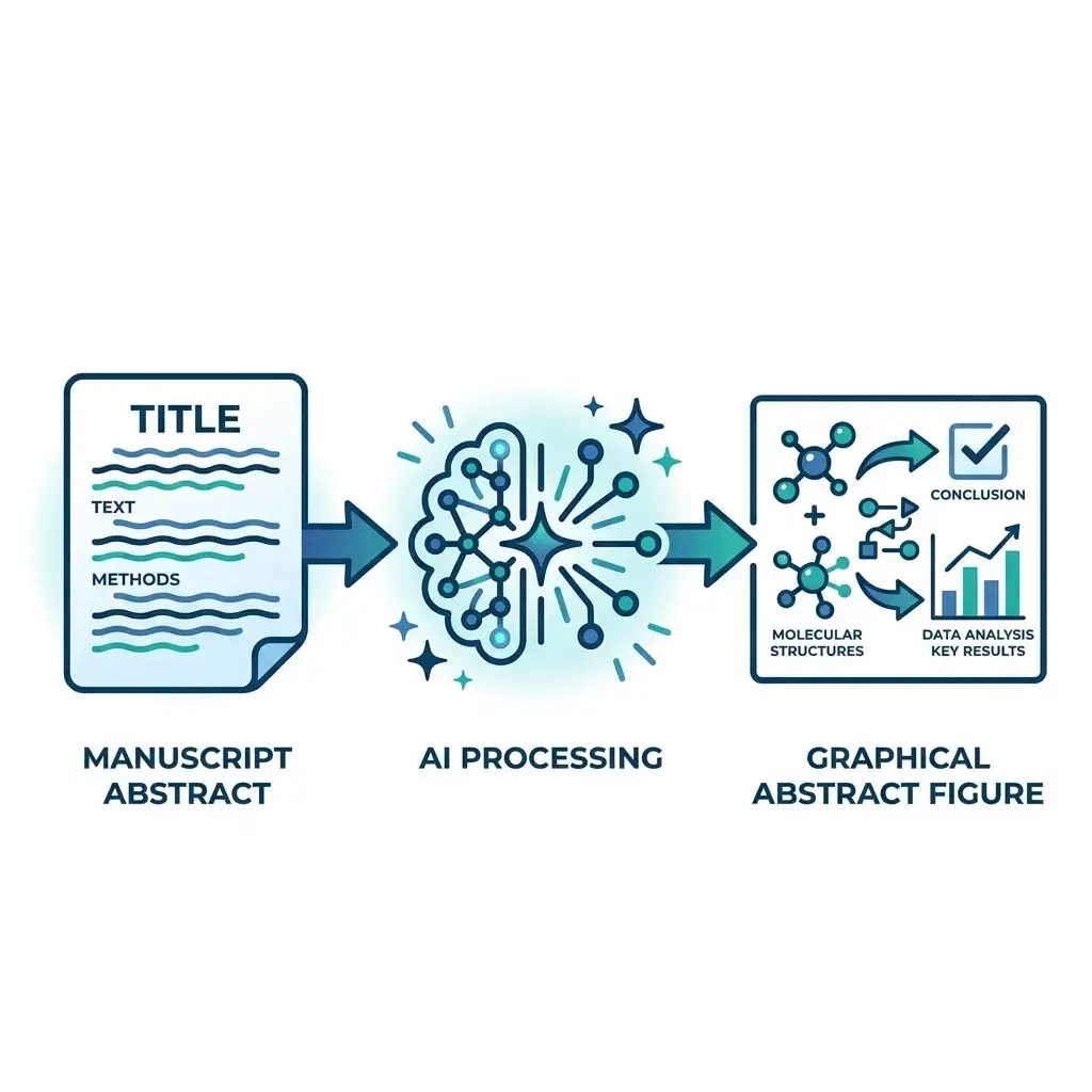
Resumen gráficoNuevo

Resumen gráfico

Pega el resumen de tu manuscrito y consigue un resumen gráfico listo para revista en formato Elsevier, Cell Press, Wiley o ACS en menos de un minuto.

Abrir herramienta
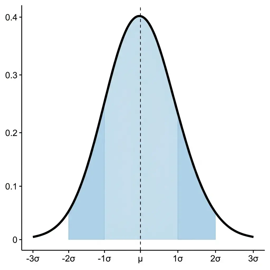
Campana de GaussNuevo

Campana de Gauss

Describe los parámetros de tu distribución en lenguaje natural y obtén una curva normal lista para publicar con sombreados, etiquetas y anotaciones.

Abrir herramienta
Generador de diagramas de flujo PRISMANuevo

Generador de diagramas de flujo PRISMA

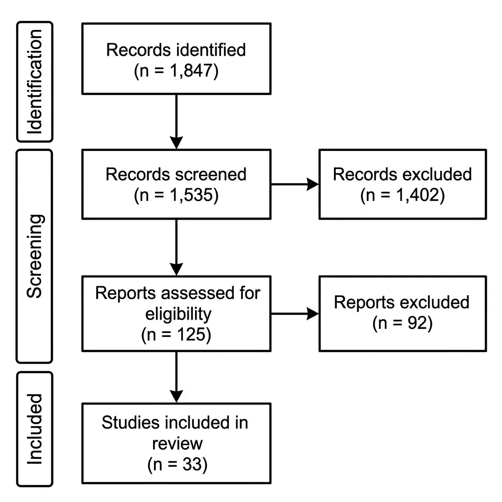
Convierte tus recuentos de cribado en un diagrama de flujo PRISMA 2020: tres fases, cajas de exclusión y exportación en PNG 300 DPI o SVG para revisiones sistemáticas y metaanálisis.

Abrir herramienta
Generador de diagramas de flujo CONSORTNuevo

Generador de diagramas de flujo CONSORT

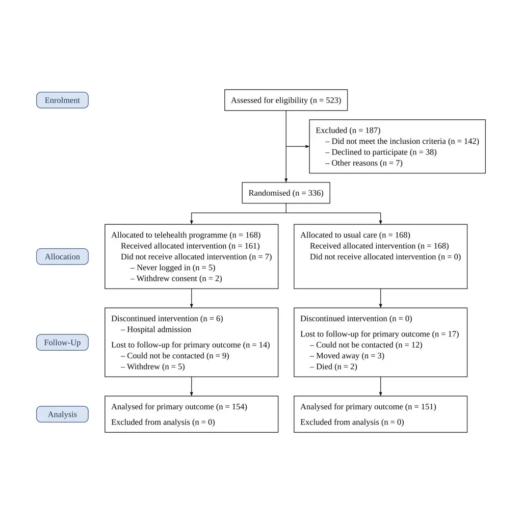
Pega el flujo de participantes de tu ensayo y obtén un diagrama CONSORT 2025 con las cifras compuestas a partir de tu texto: de dos a cinco grupos, motivos listados, PNG a 300 DPI o SVG.

Abrir herramienta
Generador de pósters científicosNuevo

Generador de pósters científicos

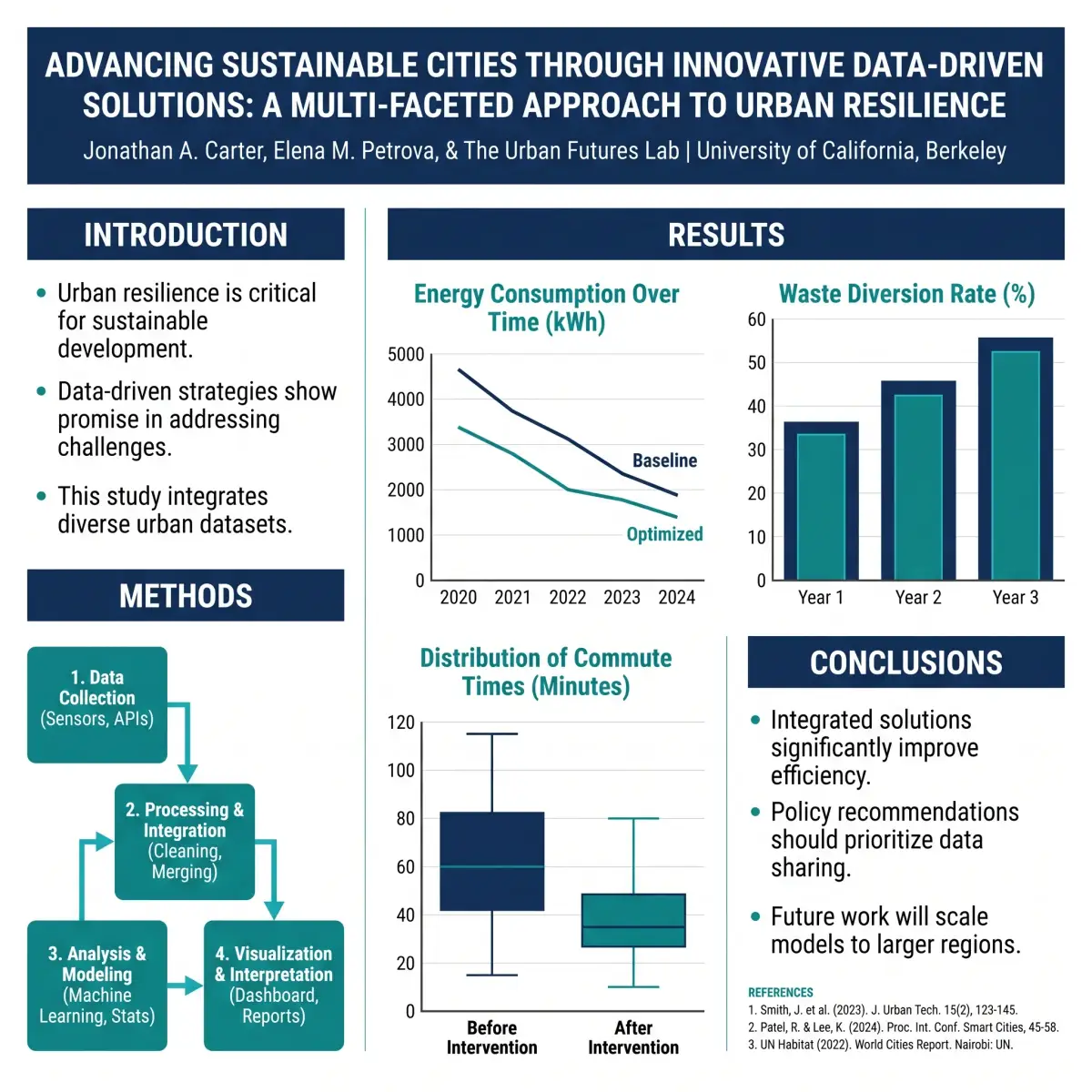
Convierte tu resumen, métodos y resultados en un póster de congreso completo: cabecera, secciones IMRyD, gráficos y referencias, para paneles de 48 × 36 in o atriles A0.

Abrir herramienta
Diagramas de cuerpo libre

Diagramas de cuerpo libre

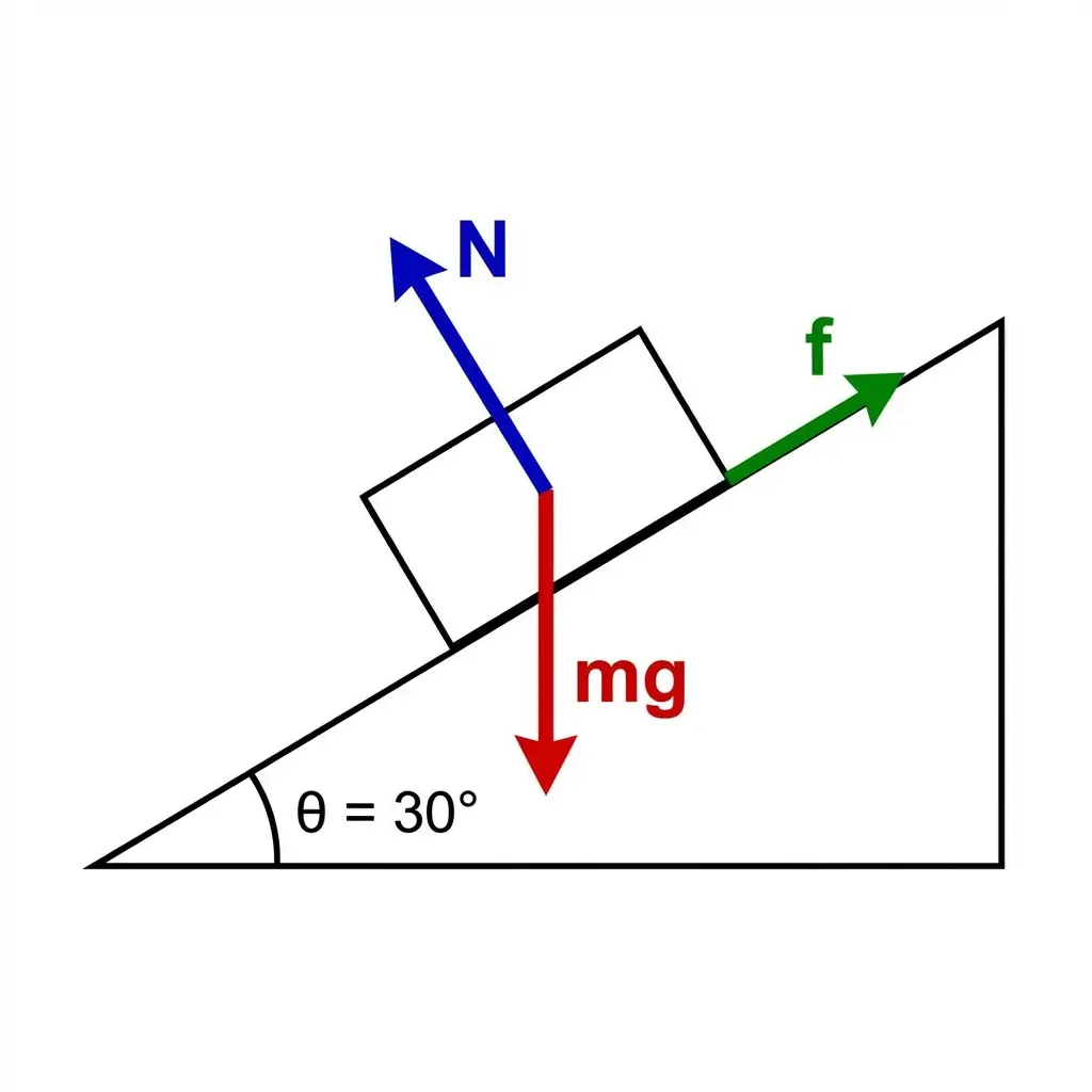
Convierte problemas de física en diagramas de cuerpo libre limpios, con fuerzas, ángulos y etiquetas ya dibujados.

Abrir herramienta
Featured on Findly.tools