Create
")
If you have ever opened a manuscript draft and thought "these figures look like a 2008 PowerPoint deck," the problem is almost never the chart type — it is the color palette. A good research paper color palette does three things at once: it survives black-and-white printing, it stays readable for the 8% of male reviewers with color-vision deficiency, and it signals to the editor that the authors know what they are doing.
This guide collects ten color palettes for scientific publication that are actually used in high-impact journals today, with hex codes you can paste into Matplotlib, ggplot2, or Illustrator. Each palette includes the exact use case it is built for, the journals that accept it without pushback, and the trap to avoid. These are the color schemes for scientific articles that are not boring — the colors palettes in high impact journals like Nature, Science, and Cell that get figures past peer review on the first round.

Stop hand-coding hex values into every chart. Try Vizcept's Graphical Abstract Maker → Build publication-ready figures with these palettes at your fingertips. Free to try, no signup.
| # | Palette | Type | Color-blind safe | Grayscale-safe | Best for |
|---|---|---|---|---|---|
| 1 | Okabe-Ito | Qualitative | ✅ | ⚠️ Partial | Categorical groups (≤8) |
| 2 | Paul Tol Bright | Qualitative | ✅ | ✅ | Line plots, bar charts |
| 3 | Tableau 10 | Qualitative | ⚠️ | ❌ | Dashboards, exploratory figures |
| 4 | ColorBrewer Set2 | Qualitative (pastel) | ✅ | ⚠️ | Soft category fills |
| 5 | Viridis | Sequential | ✅ | ✅ | Heatmaps, density plots |
| 6 | Cividis | Sequential | ✅ (perfect) | ✅ | When deuteranopia is a concern |
| 7 | YlOrRd | Sequential (warm) | ⚠️ | ✅ | Intensity, concentration |
| 8 | RdBu | Diverging | ✅ | ✅ | Correlations, log-fold change |
| 9 | Crameri Vik | Diverging (scientific) | ✅ | ✅ | Geosciences, anomalies |
| 10 | Glasbey | Qualitative (high-N) | ⚠️ | ❌ | Cluster plots with >12 classes |
Three palettes are responsible for most "this looks like a textbook from 1995" feedback: Excel's default blue-orange-grey series, Matplotlib's old jet rainbow, and PowerPoint's Office theme. They are boring not because they are simple, but because they are the same palettes every reviewer has seen for fifteen years.
The opposite of boring is not loud. The opposite of boring is intentional. A figure painted in three Okabe-Ito hues feels current; the same figure painted in Excel-default #4472C4 blue and #ED7D31 orange feels stale. The escape route is not more colors — it is moving to a palette your reviewer has never associated with a poorly-made chart. That is the whole reason this list exists.
A second source of boring is the use of full saturation across every category. Cell Press figures rarely use #FF0000; they use #D62728 (Tableau's red), which reads almost the same on a screen but does not vibrate against #1F77B4 blue. Backing off saturation by 10–20% is the single fastest way to make a figure look like it belongs in a journal rather than a slide deck.
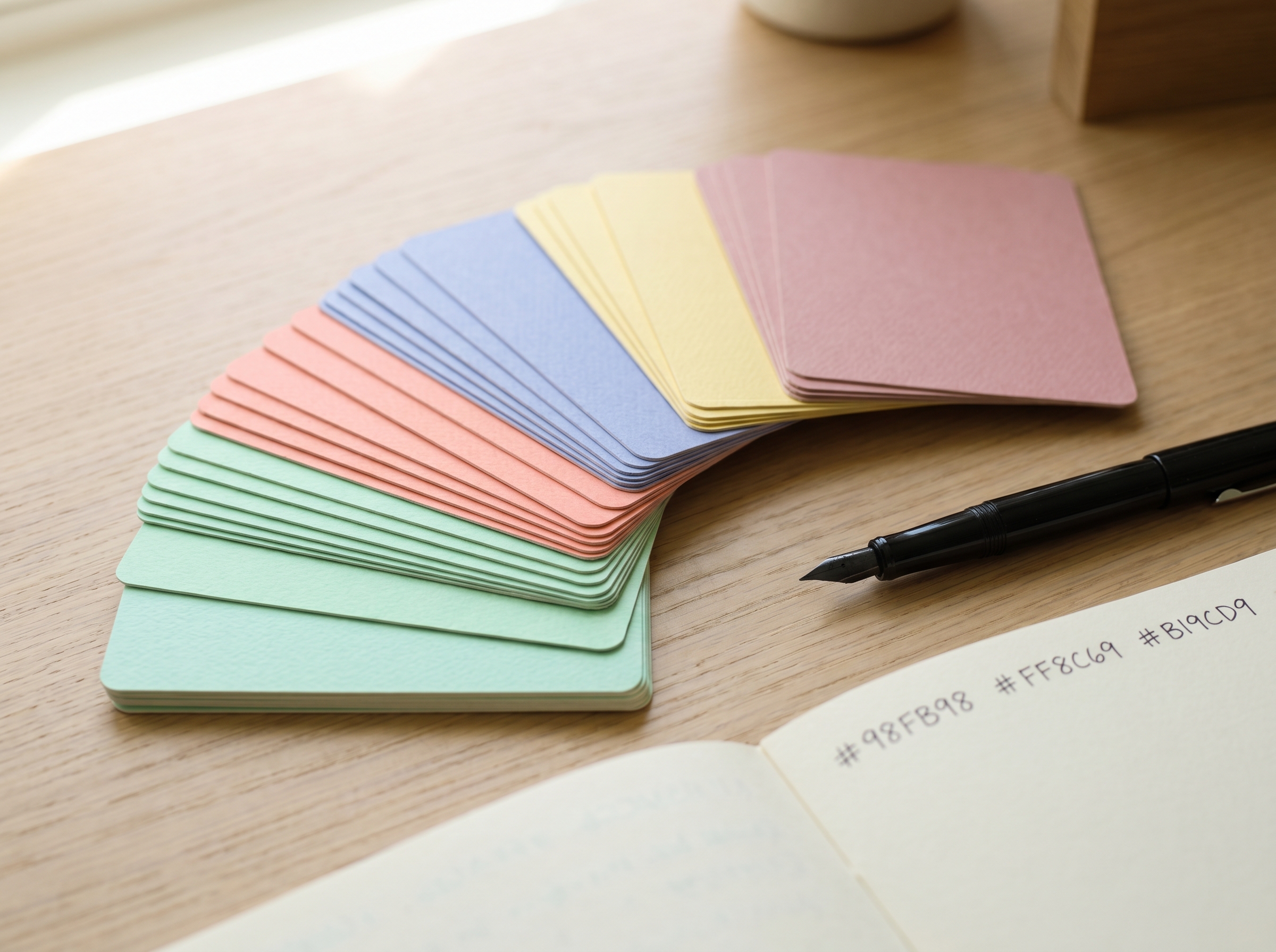
Hex: #000000 #E69F00 #56B4E9 #009E73 #F0E442 #0072B2 #D55E00 #CC79A7
Designed by Masataka Okabe and Kei Ito in 2002, this 8-color qualitative palette is the de facto standard for color-blind safe categorical figures. Bang Wong's influential 2011 Nature Methods piece on color blindness is built on it, which is why almost every reviewer at a high-impact journal recognizes it on sight.
Use it whenever you have up to 8 discrete groups. Avoid it for sequential data — the colors do not have a meaningful order.
# ggplot2
scale_colour_manual(values = c("#E69F00", "#56B4E9", "#009E73",
                               "#F0E442", "#0072B2", "#D55E00", "#CC79A7"))
Hex: #4477AA #EE6677 #228833 #CCBB44 #66CCEE #AA3377 #BBBBBB
Paul Tol, an astronomer at SRON, publishes a technical note on color schemes that has become a quiet standard in physics and astronomy. The Bright set has 7 distinguishable colors that remain distinct in CMYK print and survive photocopy.
The grey is intentional — use it for "control" or "other" categories instead of blowing a hue on something secondary.
Hex: #1F77B4 #FF7F0E #2CA02C #D62728 #9467BD #8C564B #E377C2 #7F7F7F #BCBD22 #17BECF
Matplotlib adopted this as tab10 in version 2.0 (2017), and it is what you get from plt.plot() if you do nothing. That is the catch: it is also what every exploratory notebook in the world uses, so it can read as "I never customized my figures." Fine for first-pass and dashboards; consider Okabe-Ito or Paul Tol for the manuscript version.
Hex: #66C2A5 #FC8D62 #8DA0CB #E78AC3 #A6D854 #FFD92F #E5C494 #B3B3B3
ColorBrewer, built by cartographer Cynthia Brewer at Penn State, is the original evidence-based palette library. Set2 is pastel and works well for stacked bars, area fills, or any chart where saturated colors would dominate the data ink.
Skip it when you need the colors to also work on a black background; the pastels wash out.
Hex (5-stop): #440154 #3B528B #21908C #5DC863 #FDE725
Viridis was designed by Stéfan van der Walt and Nathaniel Smith for Matplotlib 1.5 to fix the perceptual problems of jet. It is monotonically increasing in luminance, which means it does the right thing when printed in grayscale and stays accurate for protanopia, deuteranopia, and tritanopia. Use it for heatmaps, density plots, and any 2D map of continuous value.
import matplotlib.pyplot as plt
plt.imshow(data, cmap='viridis')
Hex (5-stop): #00204D #414D6B #7C7B78 #BCAF6F #FFEA46
Cividis is the only sequential colormap mathematically optimized so that people with the most common form of color blindness see the same gradient as people without. It is slightly less attractive than Viridis on a screen but a stronger choice when the figure is going on a poster or in supplementary material where you have no control over how it is viewed.
Hex (5-stop): #FFFFB2 #FECC5C #FD8D3C #F03B20 #BD0026
A ColorBrewer classic for concentration, intensity, or risk. The white-to-deep-red gradient reads as "low to high" intuitively in any cultural context. The trap: it is not color-blind safe in the strict sense — yellow-green observers may compress the bottom half of the scale. Pair it with explicit numeric legends.
Hex (5-stop): #CA0020 #F4A582 #F7F7F7 #92C5DE #0571B0
The reference diverging palette for showing positive vs. negative deviation from a midpoint: correlation matrices, log-fold change in differential expression, anomaly maps. Use it whenever zero is meaningful — never for purely sequential data, where it will mislead the reader into searching for a sign change that does not exist.
Hex (5-stop): #001260 #5680B5 #F5F5F5 #D67A6A #5C0000
Fabio Crameri's Scientific Colour Maps, introduced in a 2020 Nature Communications paper, are perceptually uniform and color-blind safe by construction. Vik is the diverging member and is now the de facto choice in seismology, oceanography, and climate modeling. If you submit a geoscience figure with jet in 2026, expect a comment from at least one reviewer.
Hex (first 8): #0000FF #FF0000 #00FF00 #000033 #FF00B6 #005300 #FFD300 #009FFF
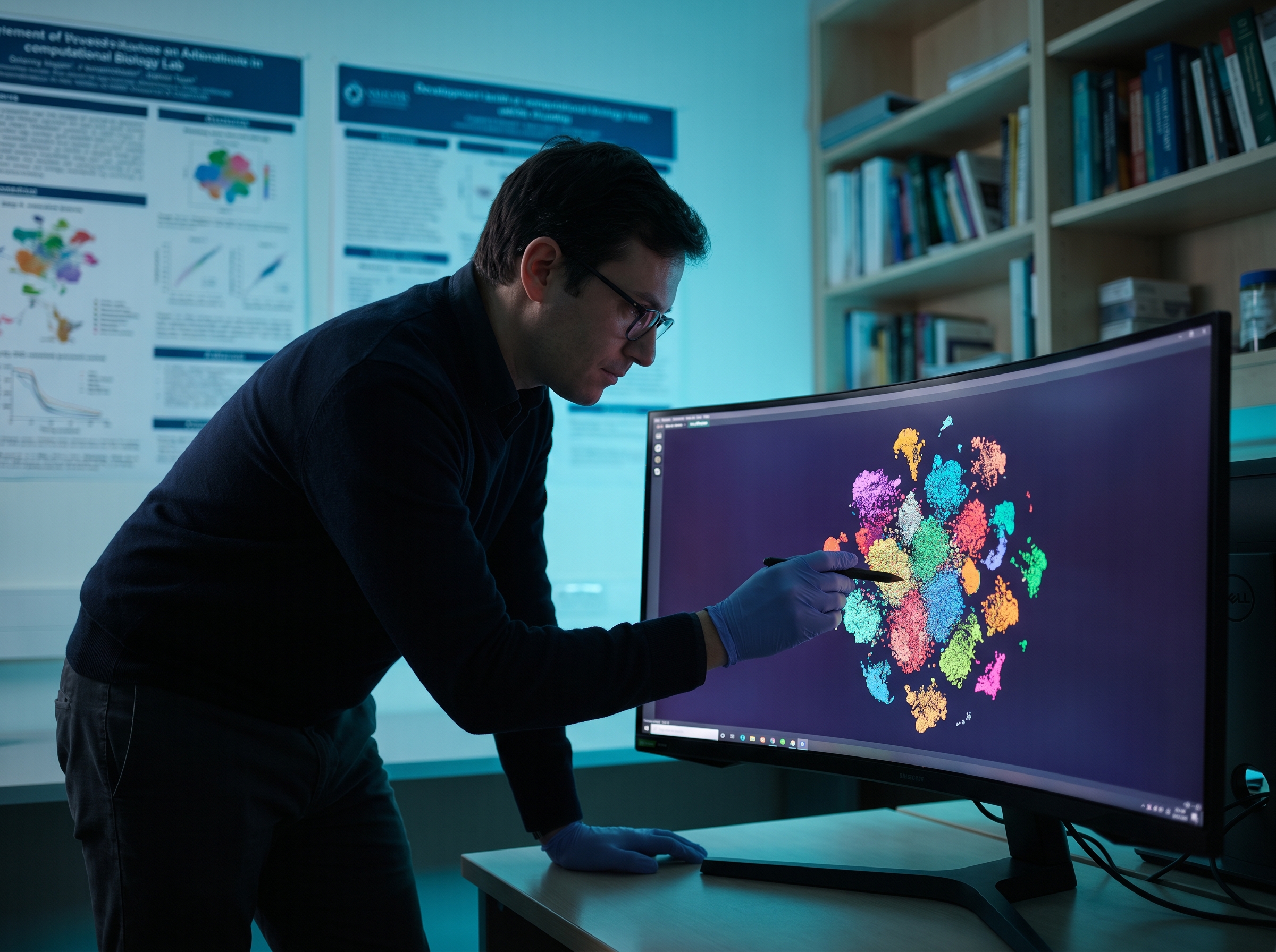
When you have 15, 30, or 60 categories (clusters in single-cell RNA-seq, regions in a brain atlas, taxa in a microbiome plot), every qualitative palette above runs out. The Glasbey algorithm generates maximally distinct colors by construction. It is not color-blind safe and not pretty, but it remains the right answer when distinctness is the only thing that matters.
I cannot tell you the editor at Nature has a preferred hex code, and anyone who claims otherwise is selling something. What you can observe by reading the figures these journals publish is that they cluster around a handful of conventions.
Nature, Nature Methods, Nature Communications — figures lean on muted qualitative palettes (Okabe-Ito and close relatives) and Viridis-family sequentials. Saturated primary colors are rare outside of structural biology cartoons. The Nature guide to authors on figures explicitly asks for color-blind accessibility.
Science, Science Advances — slightly warmer palette mix, heavier use of orange-red diverging in panels showing perturbation effects. Categorical figures often use 3–4 colors maximum per panel, even if the underlying data has more groups (the rest are collapsed or shown in a separate panel).
Cell, Cell Reports, Molecular Cell — Cell Press house style favors slightly desaturated Tableau-adjacent reds and blues (#D62728, #1F77B4 territory). Heatmaps are overwhelmingly Viridis or RdBu. Genomic tracks usually pick from a custom Okabe-Ito subset.
NEJM, JAMA, BMJ, The Lancet — medical journals are conservative: navy, dark red, grey, with occasional teal. Multi-color qualitative palettes are uncommon; most comparisons are 2–4 lines with strong typographic labels.
PNAS, eLife, PLOS Biology — open-access journals tend to be the most adventurous, with strong adoption of Crameri colormaps in earth-science papers and full Viridis adoption for any continuous data.
The pattern across all of these: the higher the impact factor, the fewer colors per figure. If your draft has eight colors in a single panel, the most journal-adjacent move you can make is to collapse it to three or four and use shape or facet for the rest. If you're drafting figures in Vizcept's Graphical Abstract Maker, the journal-style presets already nudge you toward the 3-to-4-color discipline above.

jet or rainbow. It is not perceptually uniform, it lies about the data, and it has been formally criticized in Nature Communications. Replace with Viridis or Cividis.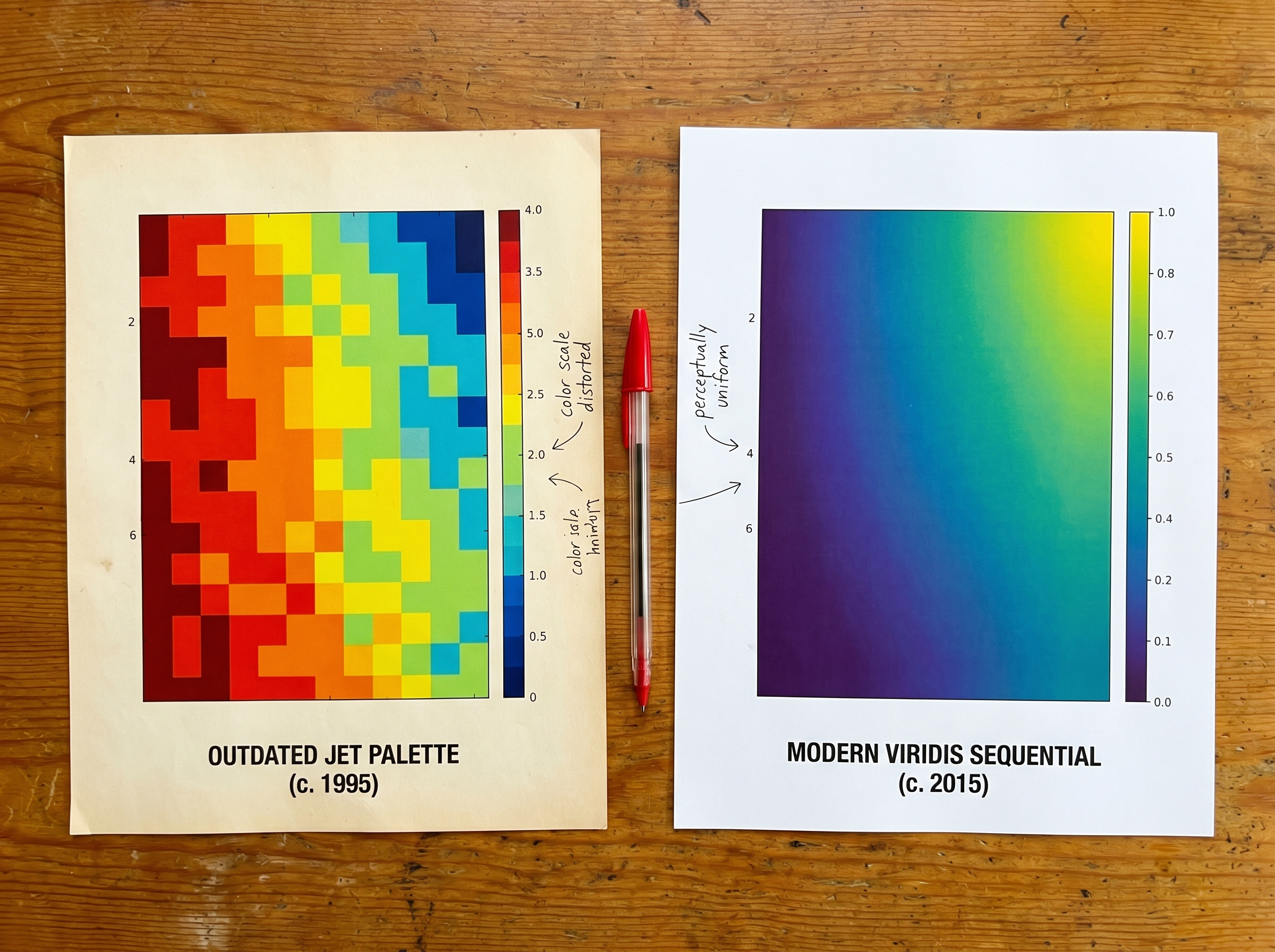
Is there a free scientific color palette generator? Yes — ColorBrewer is the longest-running free generator for sequential, diverging, and qualitative palettes, and every hex code in this guide can be lifted from it or from the SciColPal R package. For perceptually uniform options, Fabio Crameri publishes all Scientific Colour Maps as free downloads.
What color palette does Nature journal use?
Nature does not publish a single house palette. Reviewing recent issues, the recurring conventions are Okabe-Ito (or close relatives) for categorical data and Viridis for sequential heatmaps. The journal's author guide explicitly requires color-blind accessibility, which rules out jet and red-green pairs.
How do I apply these palettes in R?
Use ggsci for journal-themed palettes (scale_color_npg() for Nature-Publishing-Group-inspired hues, scale_color_lancet(), scale_color_jama()), viridis for Viridis/Cividis/Magma, and RColorBrewer for ColorBrewer sets. For Crameri Vik, install the scico package.
Which palette is best for a research paper with 15+ groups? Glasbey is the only honest answer. Above 10–12 categories, every perceptually-designed palette collapses; the right move is usually to ask whether 15 groups truly need to be on one chart, or whether faceting reduces it to multiple readable panels.
Are these palettes safe for color-blind reviewers? Okabe-Ito, Paul Tol Bright, Viridis, Cividis, RdBu, and Crameri Vik are color-blind safe by design. Tableau 10, YlOrRd, and Glasbey are not — use them only when the audience does not include people relying on color alone to read the figure.
Join the community
Subscribe to our newsletter for the latest news and updates


")
