Create

If you came here for one answer, set your font sizes for A1 poster layouts around this range: 70-90 pt for the title, 36-48 pt for authors, 36-44 pt for section headings, 24-32 pt for body text, and 18-24 pt for captions or references. That range keeps a scientific poster readable from normal conference distance without forcing every paragraph to fight for space.
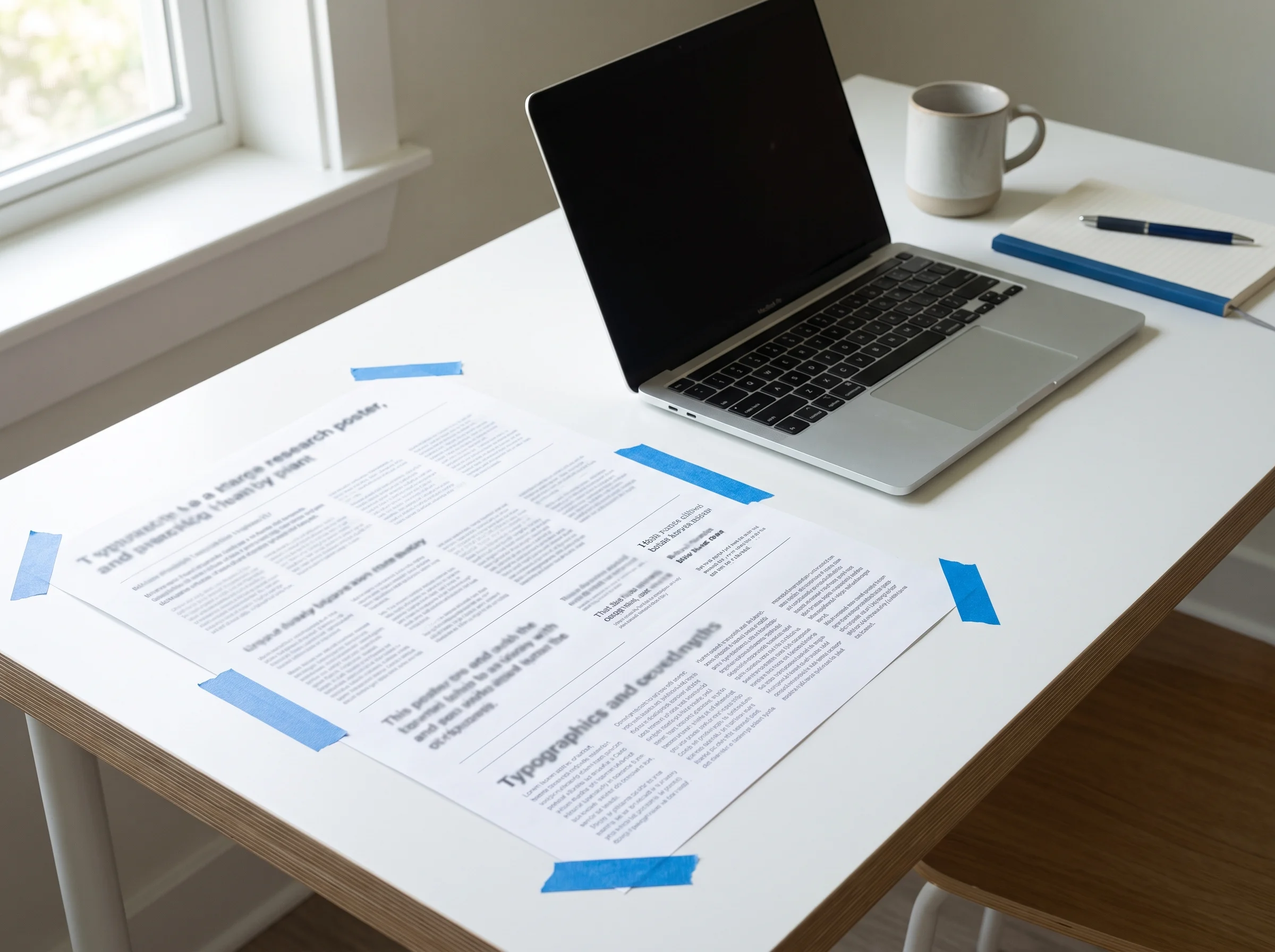
The trap is treating A1 like a giant Word document. A poster is a reading path, not a paper pasted onto a board. Your font scale should tell the viewer what to read first, what to scan next, and what can wait until they step closer.
Designing the figures as well as the text? Use the AI diagram maker -> to turn research notes into clean visual panels before you lock the final poster typography.
Use this table as a starting point, then test it at the actual viewing distance. A1 is 594 x 841 mm, so the same 24 pt text that feels large on a laptop may feel modest on a wall.
| Poster element | Safe A1 starting size | When to go larger | When to go smaller |
|---|---|---|---|
| Main title | 70-90 pt | Busy poster hall, long title, distant traffic | Very short title with strong contrast |
| Author names | 36-48 pt | Author list matters to the event | Many affiliations competing for space |
| Section headings | 36-44 pt | Four-column layout or dense figures | Few sections with large white space |
| Body text | 24-32 pt | Viewers stand 1.5-2 m away | Close-up reading, handout-style poster |
| Figure labels | 20-28 pt | Multi-panel figures or axis labels | Labels are repeated in captions |
| Captions and references | 18-24 pt | Captions carry key interpretation | References are optional background |
This scale consolidates guidance from university poster resources. The UC Davis Undergraduate Research Center notes that 24-36 pt is a practical starting range for poster text and gives legibility examples by distance. Sheffield Hallam University lists A1 ranges that run much larger for titles and headings. The University of York emphasizes that poster type must be larger than handheld document type because viewing distance changes the job of the text.
A scientific poster has three reading distances.
At five meters, the title should tell a passerby what problem the poster solves. At two meters, the section headings should reveal the story line. At one meter, the body text, figure labels, and captions should be readable without leaning in.
That is the practical reason body text below 24 pt usually fails on A1. It may print cleanly, but printing is not the same as reading. A 12 pt paragraph can survive on paper and still lose the viewer in a conference aisle.
Use this rule before you adjust anything else: if the body text cannot be read comfortably from about one meter, reduce words before you reduce type.
Aim for roughly 250-400 words on an A1 research poster. Nanyang Technological University Library gives that same range for A1 posters, while the University of York suggests 300-500 words as a typical academic poster target.
Those numbers matter because font size and word count are tied together. If your A1 poster needs 700 words, your typography will become a compression tool instead of a communication system. The result is usually small text, crowded columns, and figures that no one has time to interpret.
A workable A1 text budget looks like this:
| Section | Word budget |
|---|---|
| Title and subtitle | 10-18 words |
| Background or problem | 40-70 words |
| Methods | 50-80 words |
| Key results | 80-130 words |
| Conclusion or takeaway | 35-60 words |
| Captions and figure notes | 40-80 words |
The stronger poster is rarely the one with more explanation. It is the one that makes the viewer ask better questions in front of you.
For A1 scientific posters, start with a clean sans-serif typeface. Arial, Helvetica, Calibri, Inter, Source Sans 3, and Aptos all work because their letterforms stay clear at distance. Serif faces can work for short labels, but they are usually harder to read in dense poster body text.
Use no more than two font families. A simple system is enough:
Avoid decorative, script, compressed, or all-caps body text. They may look distinctive in a design file, but they slow down a tired viewer who is scanning twenty posters in one session.
Many poster templates are built for A0 or 36 x 48 inch boards, then reused for A1. Do not scale every number blindly.
If an A0 template uses 100 pt title, 56 pt headings, and 32 pt body text, a reasonable A1 version might use 80 pt title, 40 pt headings, and 26-28 pt body text. Keep the body text within the 24-32 pt A1 range unless the poster will be read very close.
PowerPoint adds another source of confusion: the point size is constant across page sizes. A 24 pt label stays 24 pt whether the slide is A4 or A1. If you build at half scale, such as A3 for an A1 print, remember that 12 pt in the file becomes 24 pt after enlargement. Confirm the final export size before judging readability.
Do not wait for the conference printer to tell you the text is too small. Run a cheap readability test.
If the test fails, change the hierarchy in this order: cut words, widen columns, increase line spacing, then increase font size. Shrinking the font should be the last resort, not the first move.
When headings, body text, and captions are too close in size, the viewer cannot see the structure. Keep at least 8-12 pt between headings and body text on A1.
Captions should interpret figures, not rescue unclear figures. If a chart needs a long caption to explain the axes, fix the chart first.
References can be smaller than body text, but they still need to be readable if they matter. If they do not matter to the poster conversation, move them to a QR code or a short citation line.
The title is a promise. A vague title in 90 pt is still vague. Write the result or claim first, then size it for the room.
Use 24-32 pt for A1 poster body text. Go toward 30-32 pt when viewers will stand farther away, and use 24-26 pt only when the poster is sparse and read close up.
For normal conference reading, yes. It may print sharply, but it is not comfortable for wall reading. Treat 12 pt as a production note size, not a body text size.
Start around 70-90 pt for the title. A short title can be larger, while a long title should be edited before it is squeezed into a smaller size.
A good A1 poster usually fits about 250-400 words. If you need more, use the extra detail in your spoken explanation, handout, QR code, or paper link.
You can, but a clean sans-serif is usually safer for distance reading. If you use a serif font, reserve it for short accents and keep body text simple.
They should be close, but not always identical. Use 20-28 pt for labels and axes on A1, then enlarge any label that carries the main result.
Before uploading the print file, check the poster at three levels: title from across the room, headings from a few steps away, and body text from one meter. If one level fails, the problem is usually hierarchy, not just font size.
A1 typography works when the viewer can understand the poster without starting at the first paragraph. Set the scale, cut the text, test the distance, and let the figures carry the story.
For posters with complex figure panels, create publication-ready research visuals with the graphical abstract maker -> before you spend time resizing labels by hand.
Join the community
Subscribe to our newsletter for the latest news and updates


")